Are you putting together your first CD cover, or are you looking for ways to upgrade the quality of your newest one? Don’t feel any pressure; that’s pretty much a yes or no question, and there’s no right or wrong answer, unless you just like lying to yourself about your CD plans.
If you are working on a CD cover, there are a lot of factors to consider, some of which have changed over the years.
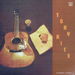
A big factor is cost. If you’re not with a record label with an in-house graphic design person, do you spend money on a graphic designer? It was simpler in the early days of independent label bluegrass releases. Generally, going out to the backyard of the record label head, shooting some pictures (sometimes with the band members squinting into the direct sunlight), then using a font you like for the title was good enough. Or there was always the guitar on the carpet next to a cup of coffee and a half-eaten sandwich approach.
Things did occasionally get complicated in those days: In bluegrass music we have this obsession with always having the current personnel in all photos. Even if Banjo Player A played on the record, but quit before the release date, it’s imperative to have a picture of Banjo Player B who did not play on the record, on the cover, because that’s who is in the band this month. I remember seeing an LP cover in which the head and neck of the new band member was cut and pasted into the shirt collar of the previous member. As I recall, he was photographed in the shade, while the other guys were in direct sunlight. The new guy was also photographed a little closer up, making him seem like he had an abnormally large head.
Don’t do this.
But a large-headed musician has caused me to digress. We were discussing cost. We live in a more competitive musical environment than existed in the early ’70s, and the appearance of your release matters, and is therefore worth spending some money on. It’s one of those things, like photography, or dentistry, that seems like you should be able to do it yourself, but it’s definitely harder than it appears.
Who cares what the cover looks like nowadays, anyway, you ask. Many people are streaming or downloading music, and are looking at an image the size of a postage stamp. A picture of an insect ought to be fine, or just the title of the album in the largest font possible. But there are DJs and reviewers to think of. That’s why, even in the digital era of buying individual tracks and playing things on shuffle, song sequence still matters. You want to create the best musical and visual impression you can, and it’s worth a little investment.
As with photography, and dentistry for that matter, there can be a pretty big price range, so it’s a good idea to shop around and get a feel for just what the range is.
Then you need to decide whether you’re using a photograph of you or your band, or some kind of artistic image for the front. Just as there are musical trends through the years, we’re not immune to trends in graphic design. Where putting the band in front of a barn or a brick wall (or the label head’s backyard) was once the norm, over the last several years, some kind of artwork or photograph, whether more contemporary and abstract, or more traditional, has become common, with the band or artist not pictured on the front at all.
This is only a problem if you have an extremely common name (stop staring at me) and it’s not going to be clear which Billy Smith you are without a picture. On the other hand, what do you care if large numbers of people accidentally buy your album? Maybe they’ll like it and just think it represents a new career direction for the Billy Smith they thought they were getting.
The artistic image option also eliminates the need to paste new heads on to other people’s bodies.
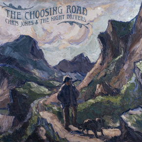
I know this is going to come off as a sneaky and shameless new CD plug (though it’s true that pre-orders are now available), but bear with me: For the cover of our new CD, we ended up using a piece of art by the wonderful Welsh landscape painter Kyffin Williams, because we were able to get the rights to it (for a fee), and the art captured what we and our label felt was a theme and feeling emerging from the music.
The common name issue wasn’t a problem either, because the guy in the painting happens to look exactly like me, or how I would look if I lived in the jagged mountains of Wales, and the dog looks exactly like my dog and completely different from the dogs of the other Chris Joneses (their dogs are homely, frankly).
Best of all, Kyffin Williams is from a town in Wales called Llanfairpwllgwyngyll. I promise you I’m not making this up. In fact the Wikipedia entry for the town says that the name is sometimes lengthened to Llanfairpwllgwyngyllgogerychwyrndrobwllllantysiliogogogoch. It goes on to say, “lengthened forms of the placename are used in various contexts.” I’m thinking that one of those contexts would be having a great deal of time on your hands. I’m wondering what the other contexts might be.
Also his first name is Kyffin and we love the painting. It was the only choice to make.
I just tell you this to illustrate that there are lots of different sources for cover images, whether already out there, or ones you hire an artist or photographer to create. Once you have a piece of art, or the band photo in front of a barn (we’ve used that, too), you still need someone with graphic design experience to turn it into a professional-looking CD cover.
So just as you wouldn’t engineer the recording yourself if you’re not an engineer, or play the banjo parts yourself if you’re not a banjo player, you should hire someone to do your cover who has experience in the field. You can still use a picture of an insect, but a good graphic designer can make that look good or at least interesting.
Also, please don’t ever do your own root canal.


